Dashboard Design
College Action Program
Designing a mentor dashboard that organizes scattered student data into one clear view
College Action Program (CAP) helps first-gen and underserved students get from college acceptance to their first day of class.
Role
UX Designer, Project Manager
Team
4 UX Designers, 1 Product Owner
Tools
Figma, FigJam
Timeline
Nov 2023 — Dec 2023
Overview
Mentors play a huge role in supporting students through enrollment, but they were juggling hundreds of students across spreadsheets, emails, scattered notes, and Google Drive folders. There was no single place to see everything.
Our goal was to design CAP’s first mentor dashboard. Something simple and predictable that helped mentors see who needed attention, understand progress quickly, and access information without digging.
Key Contributions
Facilitating design studio sessions
Wireframing & prototyping
Managing timelines & deliverables
Competitive & comparative analysis
Feature prioritization
Usability testing
Research
Challenges And Perspectives of Mentors
We interviewed mentors from TRIO programs, nonprofits, and high schools to understand their day-to-day flow. Each described the same problems:
Too many tools
Manual tracking that broke their focus
No clear way to see who needed help
Resources buried in folders and PDFs


During one session, a mentor joined late because she had just finished helping a student through a personal crisis. It was a small but real reminder of how much these mentors juggle while still trying to stay organized.
These conversations shaped the structure and priorities of the dashboard.
Defining the Problem
Mentors needed a dashboard that helped them:
Navigate tasks without losing track
Quickly understand progress
Identify students who need attention
Access the right resources in one place
We turned these needs into clear How Might We statements and used design studio sessions to sketch early ideas.
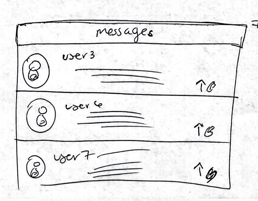
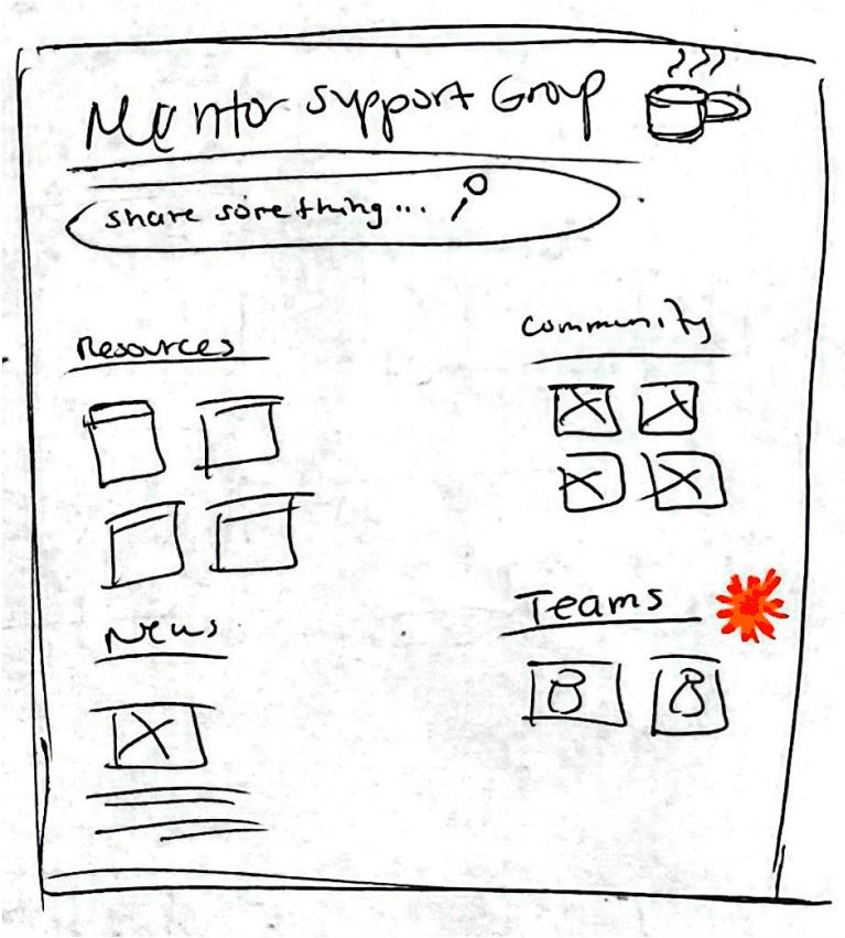
Design Approach
Make every action purposeful, clear, and in one place.
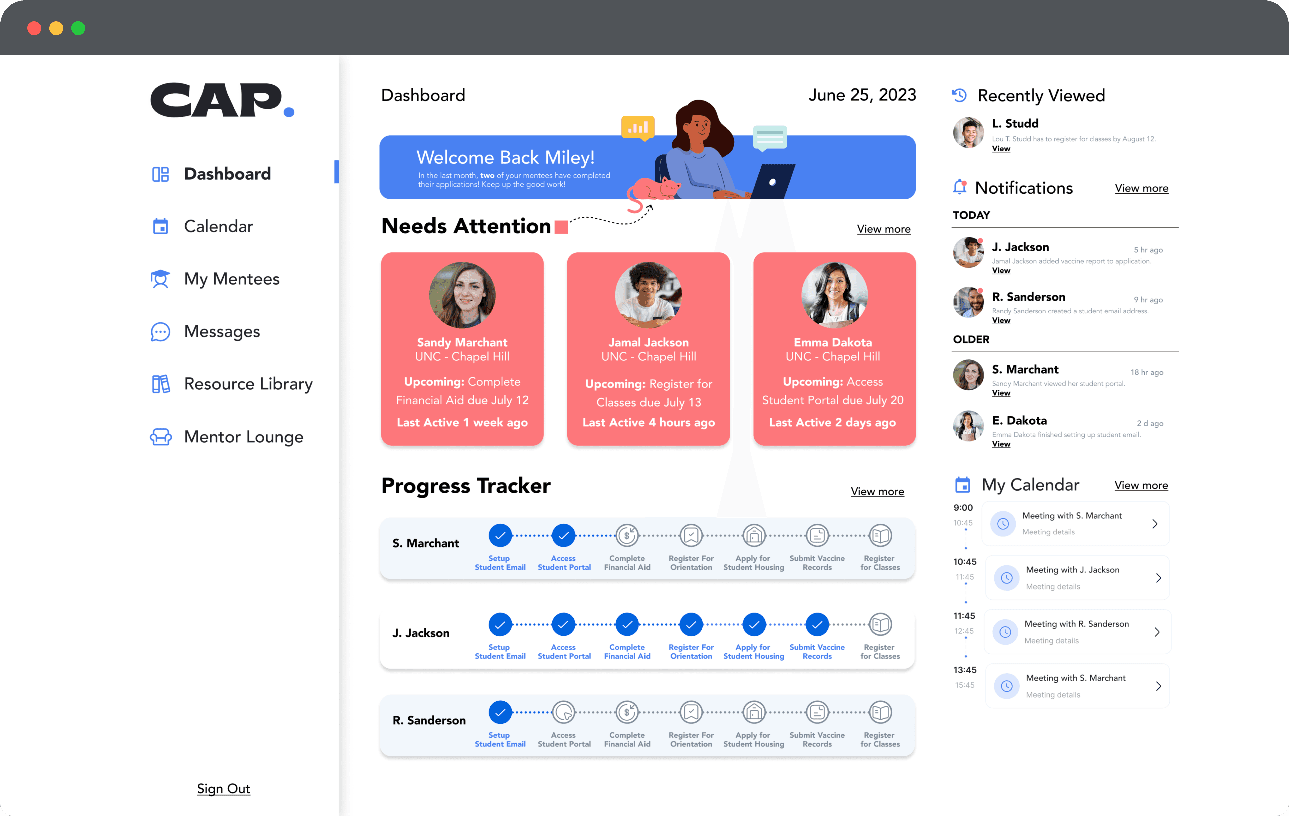
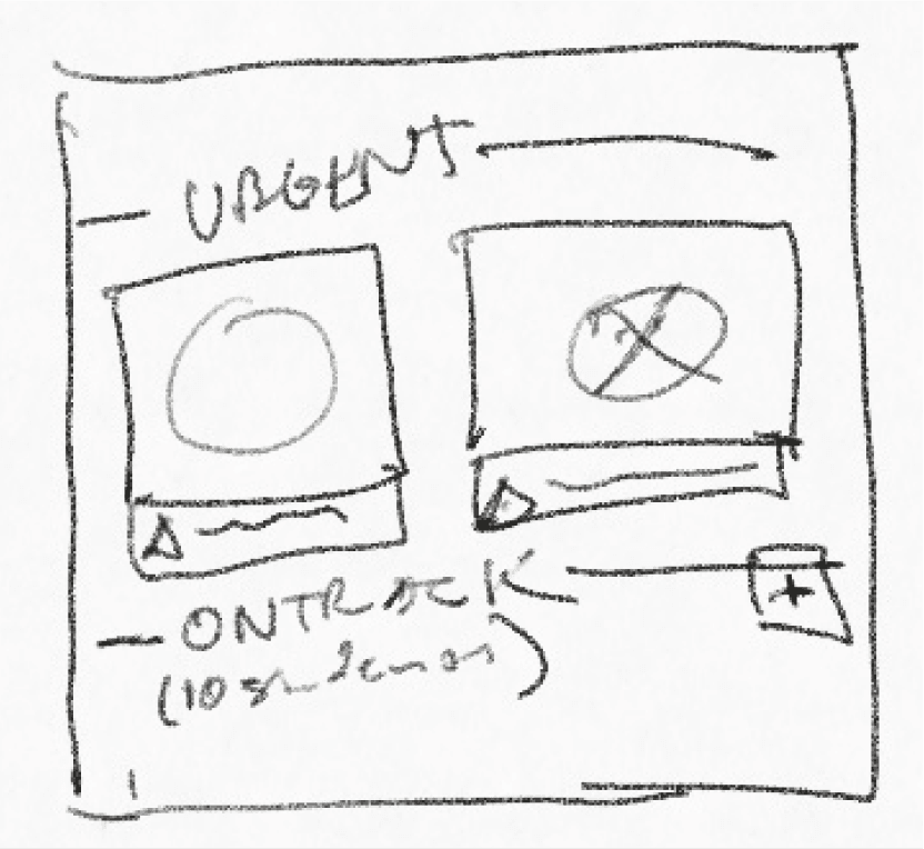
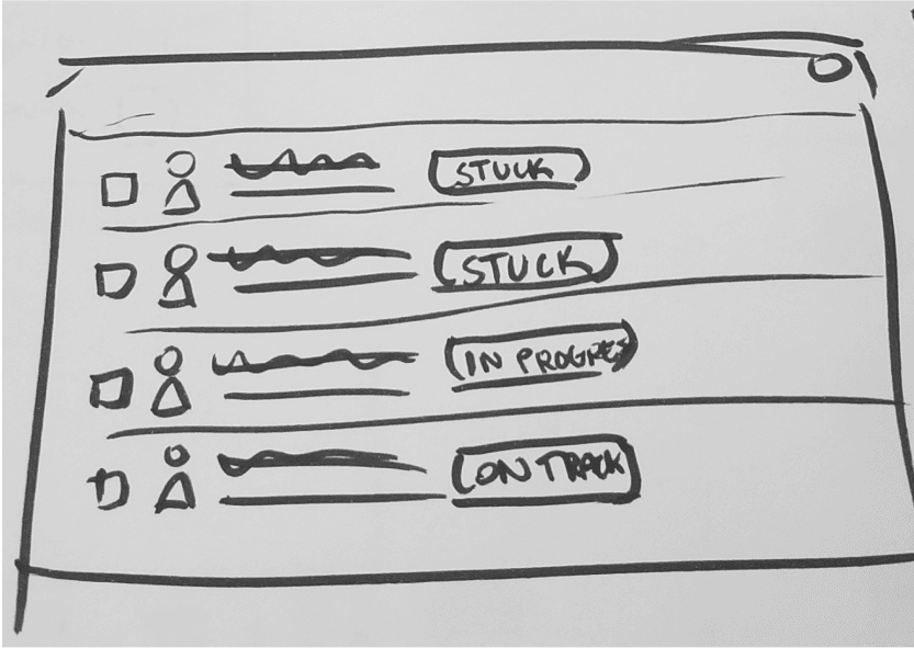
Prioritized Student Lists
Mentors needed to know who needed help first.
I explored a Kanban board, alert cards, and list views.


Lists tested fastest, especially at scale, so we chose a simple list with subtle risk indicators.
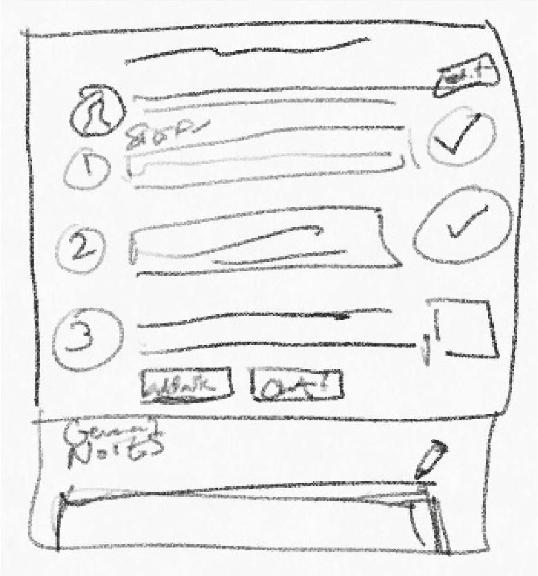
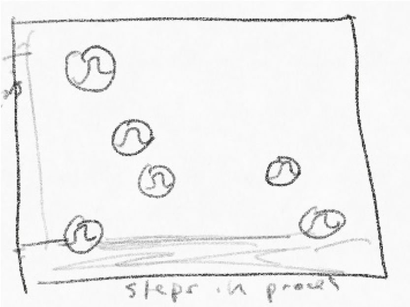
Progress Tracking
Mentors needed to see exactly where a student was in the enrollment journey.

A linear checklist with timestamps was the clearest and fastest to scan.
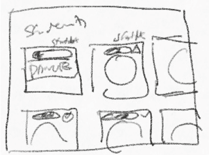
Student Profiles
Mentors switch between quick checks and deeper sessions, so I designed two levels of detail:


Snapshot Cards for status, last contact, and progress
Detailed Profiles for notes, tasks, documents, and milestones
This reduced page switching and kept context consistent.
Resource Access
Resources were scattered across multiple tools so I added contextual resource links inside each profile
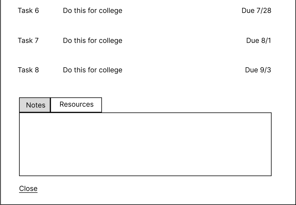
This kept mentors from breaking their flow mid-session.
Bringing It Together
Familiarity > Revolutionary
The final layout used a structure familiar to tools mentors already knew, like SCOIR and CommonApp.


This gave us a solid first pass at the full dashboard so mentors could react to the structure.

Usability Testing
Less is more
We tested this version with mentors to see how they moved through the dashboard. Their feedback highlighted a few issues.
Key actions were hard to spot
Nonessential panels such as the newsfeed were distracting
The progress tracker looked too dense

We revised the layout by tightening hierarchy, simplifying the tracker, and removing nonessential content from the right panel. After these changes, mentors reached key actions faster and described the updated dashboard as clean and intuitive.
Solution
CAP's Mentor Dashboard
Outcome
The dashboard gave mentors a single source of truth for student progress. They could:
See who needed help right away
Track milestones clearly
Log notes and communication in one place
Access resources without switching tools
It became a foundational piece of CAP’s platform and a starting point for future improvements.
— Lauren Mills, Founder and CEO, College Action Program
Reflection
This project taught me the value of organizing information before jumping into UI. Mentors didn’t need a complex system. They needed clarity: predictable sections, clean naming, and the right details in the right order.
Balancing mentor needs with CAP’s broader goals pushed me to simplify even further. And working on a tight 3-week timeline helped me stay focused: explore quickly, test early, and move with intention.
Thank you for reading!
Please feel free to reach out with any questions or to connect.