Pump Pal
Workout tracking that doesn’t get in the way.
Overview
Pump Pal is a mobile app that helps people log workouts, track progress, and plan training efficiently. The goal was to build a focused MVP that prioritized speed, clarity, and real-time usability, especially for lifters frustrated by bloated or overly basic tracking apps.
Role
Product Designer
UX/UI
User Research
Design System
Team
1 Designer
2 Developers
Timeline
Sep 2024 - Jan 2025
The Challenge
Most workout tracking apps either do too much or too little.
Apps like Strong and FlexAI offer lots of features, but they often feel slow, cluttered, or overengineered for people who just want to lift and log.
On the other hand, lifters turn to Apple Notes for its speed but lose structure, history, and progress tracking.

Lifters needed something faster than most tracking apps, but with more structure than Apple Notes.
Our Goal
Build a focused MVP that makes logging quick without giving up planning or progress tracking.
User Research
Lifters don't just track to remember. They track to improve.
I interviewed lifters and sent out surveys to understand how people track workouts, why they do it, and what keeps them consistent. I wanted to learn what makes a tool helpful, what gets in the way, and what people actually need when they’re training.
Four main themes stood out:
Progress Matters
64%
used past workouts to guide progress.
“I’m pretty sure I was doing more than 185 last time, but I didn’t want to push it.”
Stay Balanced
52%
tracked workouts to avoid repeating the same lifts.
“I track to make sure I’m not just doing the same few lifts every time.”
Feelings Count
68%
logged workouts to reflect on how they felt.
“If the workout was mid (i.e. suboptimal), logging it still helps me figure out why.”
Make It Feel Real
71%
said seeing workout history made training feel more rewarding.
“I like seeing the runs in the Nike app. It feels like I actually accomplished something.”
Takeaway
Tracking needs to feel useful and rewarding. If it slows people down or adds friction, they’ll stop using it.
Design Principles
Fitting tracking into the workout
The research gave me a clear direction. Lifters wanted to train, not troubleshoot. These three principles shaped how I responded to what they actually needed.
1
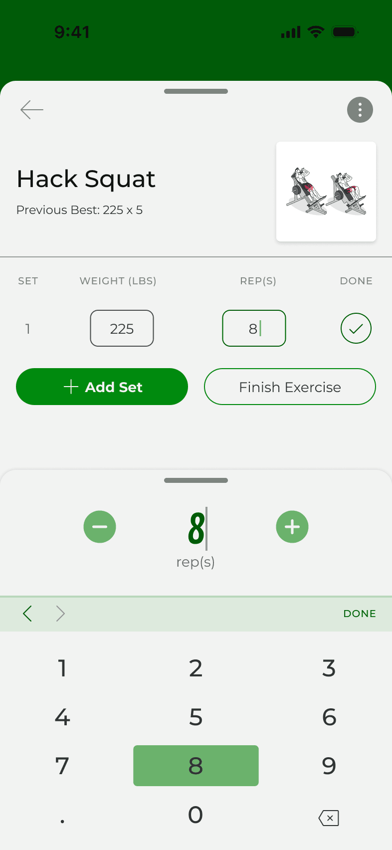
Minimal steps to log a workout
Logging needed to be fast enough to happen between sets, with no hesitation.
2
Plan, log, and review in one flow
Lifters wanted the flexibility to plan ahead or figure it out as they went. Everything had to stay in one place.
3
Clear visual feedback and progress
Progress needed to feel rewarding. People wanted to see it right away without digging.
Designing the workout experience
I brought this early research and design principles into a brainstorming session with the developers. We dumped ideas onto a shared whiteboard, which was chaos, but it definitely helped us get on the same page (literally!).
We had ideas everywhere: timers, workout templates, progress graphs, quick log shortcuts. But the more we dumped, the more obvious it became that we were getting ahead of ourselves. Before anything else, we needed to figure out the core flow.
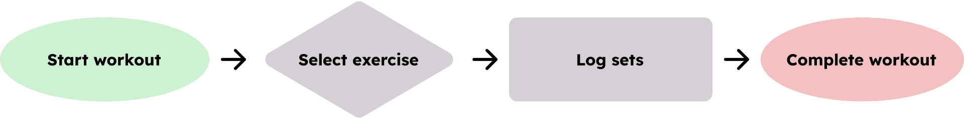
Guiding Question
What happens from the moment someone walks into the gym to when they finish their workout?
Help from a familiar app
To move forward, I looked back at how people were already tracking workouts and Apple Notes kept coming up. It wasn’t made for lifting, but it worked because it was simple, fast, and didn’t force decisions.

Focus
Instead of chasing features, we focused on one thing: making logging feel natural from start to finish.
To stay focused on that goal and grounded in our principles, I mapped the full workout flow from a real lifter’s perspective.

Design Process
Making each tap count
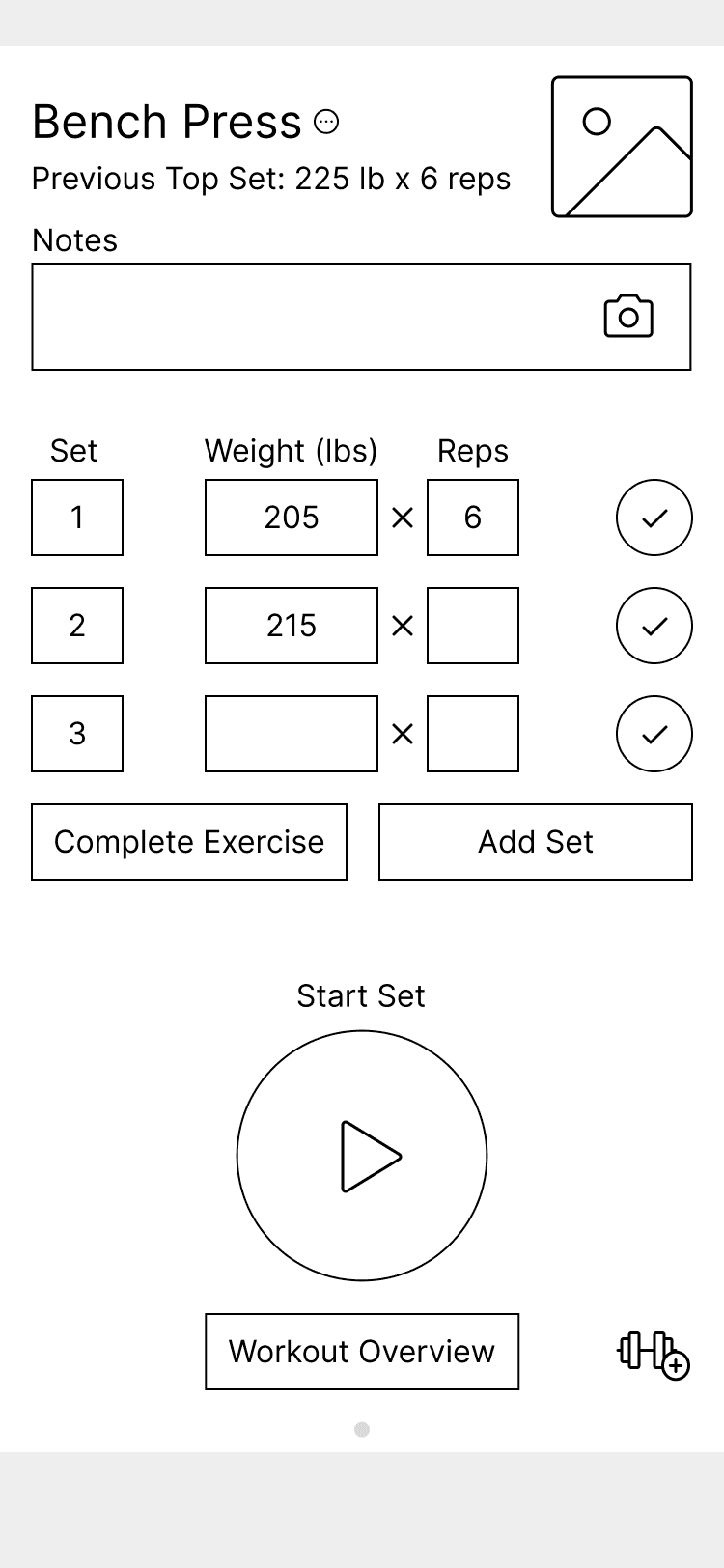
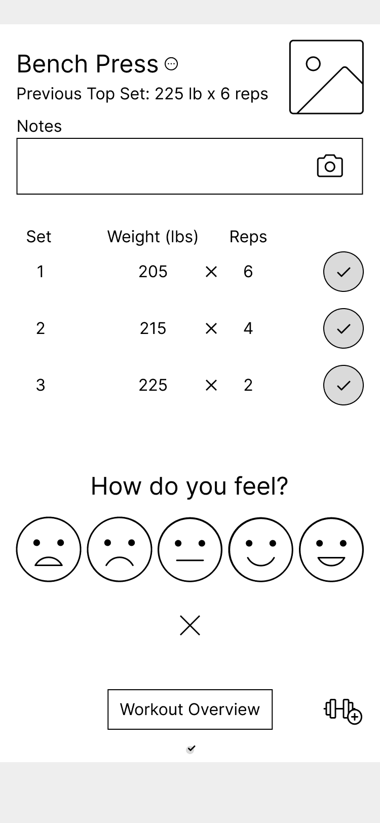
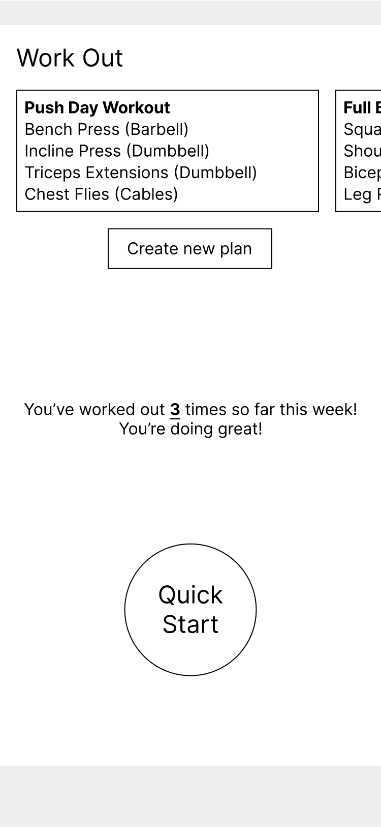
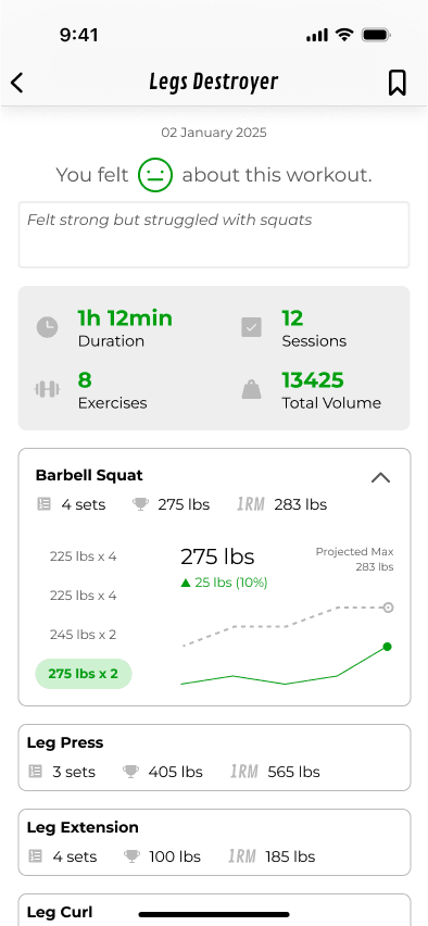
Starting with low-fidelity
I started by sketching out what logging actually looked like. Add a set, track the weight, finish the lift, then rate how it felt. Nothing fancy. Just a clean, focused flow that felt natural to move through.

Testing the navigation
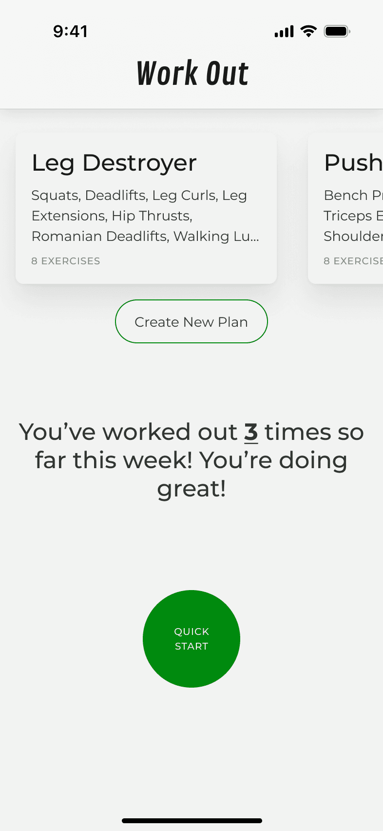
I wanted to see if the basic navigation and overall app concept made sense. So I showed people a barebones version of the app with the main tabs and a big center button.
Right away, most assumed the center button was for starting or logging a workout, even with tabs labeled Workouts and Exercises.
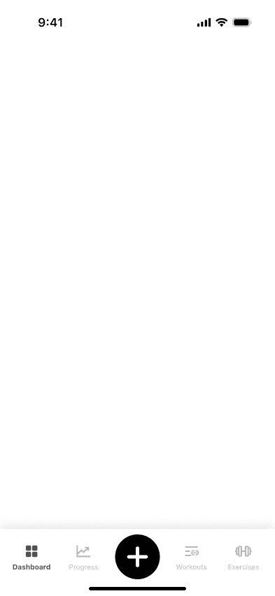
It was a good sign that people didn’t overthink it. But it also told me I’d need to tighten up the structure so the tabs and button didn’t feel like they were doing the same thing.
Quick-start inspiration
During testing, a bunch of people said they wanted to open the app and start right away and many of them mentioned Nike Run and Strava work. You just open the app, hit a button, and you’re in. This straightforward flow made sense for what we envisioned for Pump Pal.
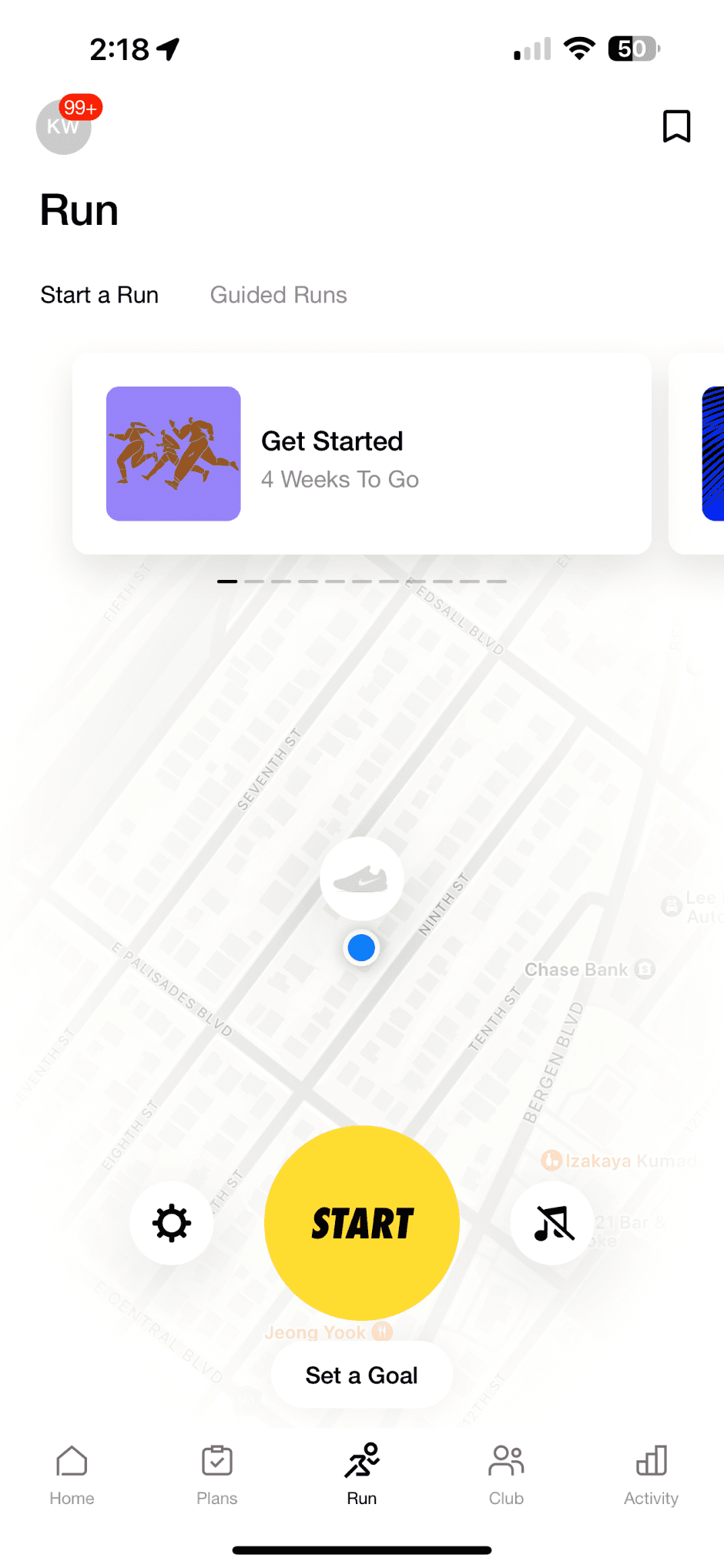
That same quick-start feel guided how I designed Pump Pal’s main button.
Visual direction and design system building
Once the core features started coming together, I turned to the visuals. I leaned into green since it felt right for fitness, progress, and growth. The fonts needed to feel strong but still easy to glance at mid-workout.
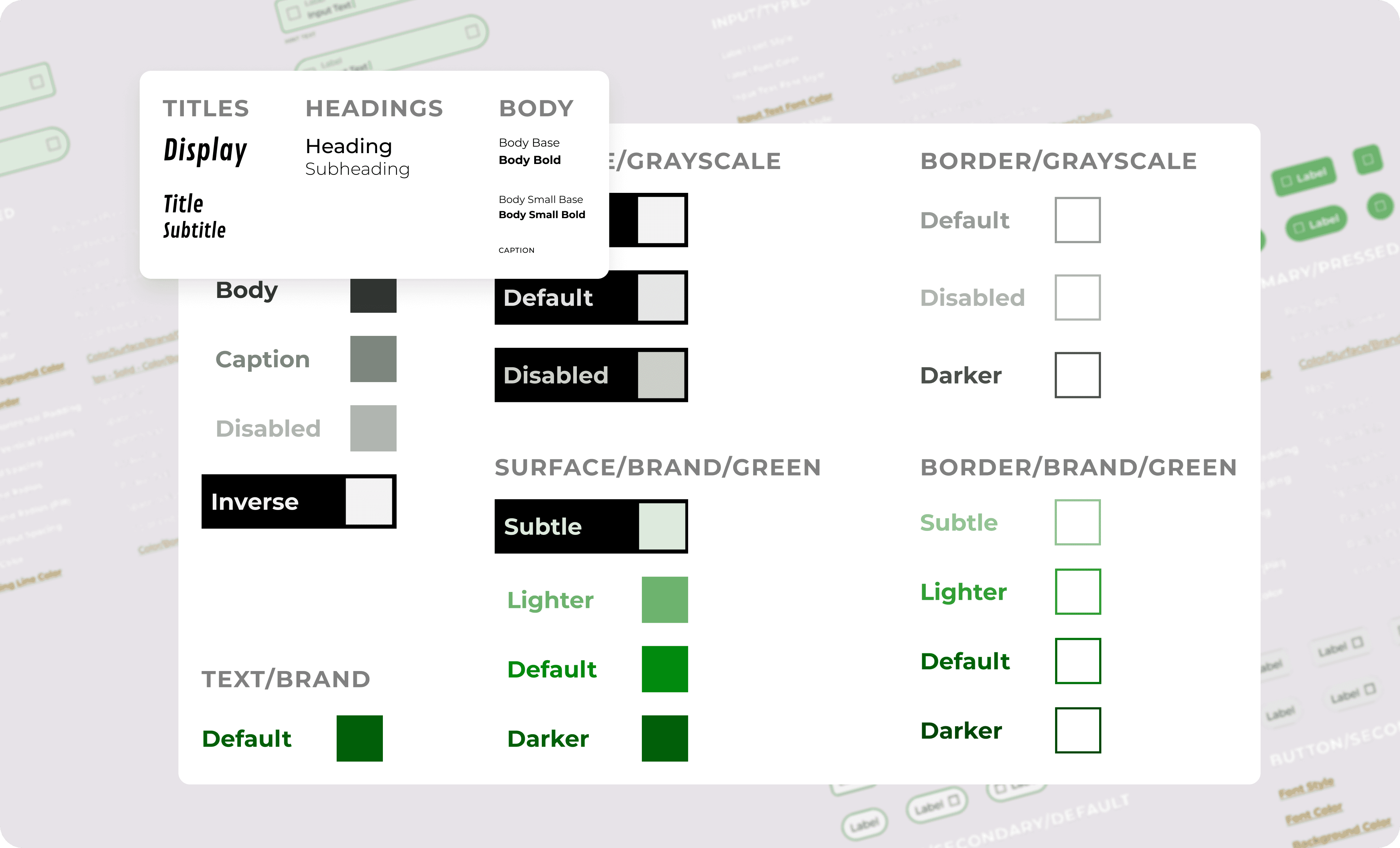
As the app got more complex, I built a simple design system to keep things consistent across screens. It helped tie everything together and made future updates easier to manage.
Deeper exploration into UI components
Once the visual direction and system were in place, I circled back to polish the pieces users would interact with most. The foundation was there, but I wanted to make sure each tap felt purposeful and responsive.
Two parts stood out as especially important during a workout: the main action button and the workout cards. These needed to be intuitive, fast, and easy to use without breaking focus.
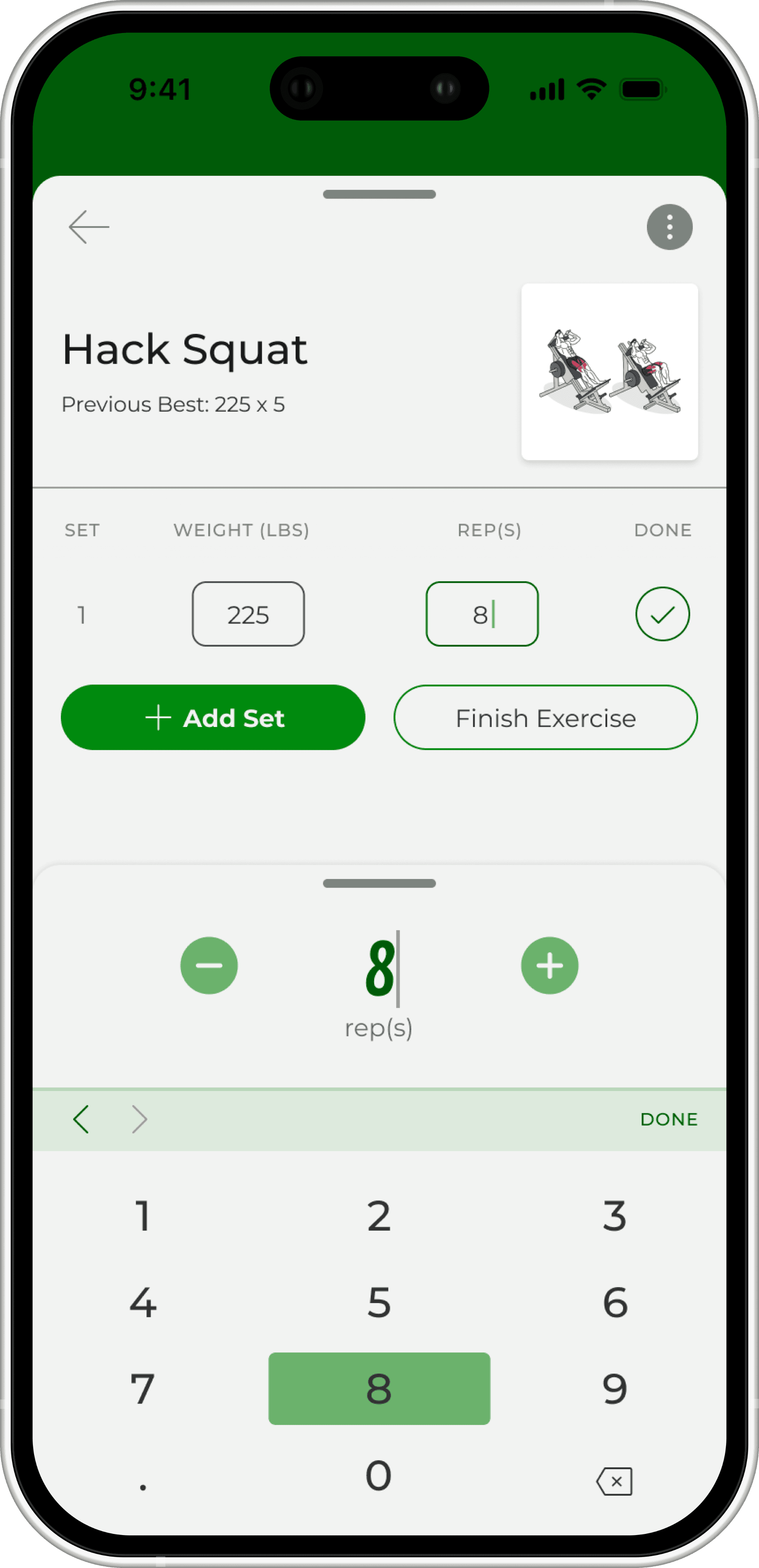
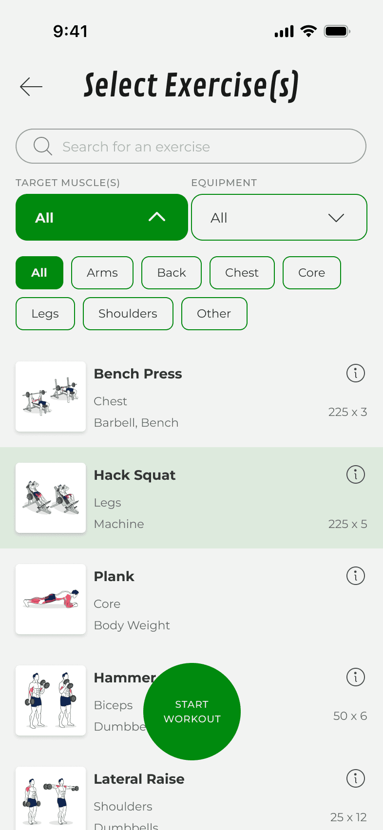
Action Button & Navigation
Users consistently expected the center button to either start a workout or log an exercise. I kept those as the two core actions and focused on making the interaction feel smooth and predictable.
Behavior: What happens when you tap?
I explored a few approaches:
Take users to a new screen
Slide up a full modal
Open a lightweight pop-up
The pop-up felt the most seamless. It kept users in context and matched the tone of the rest of the app.
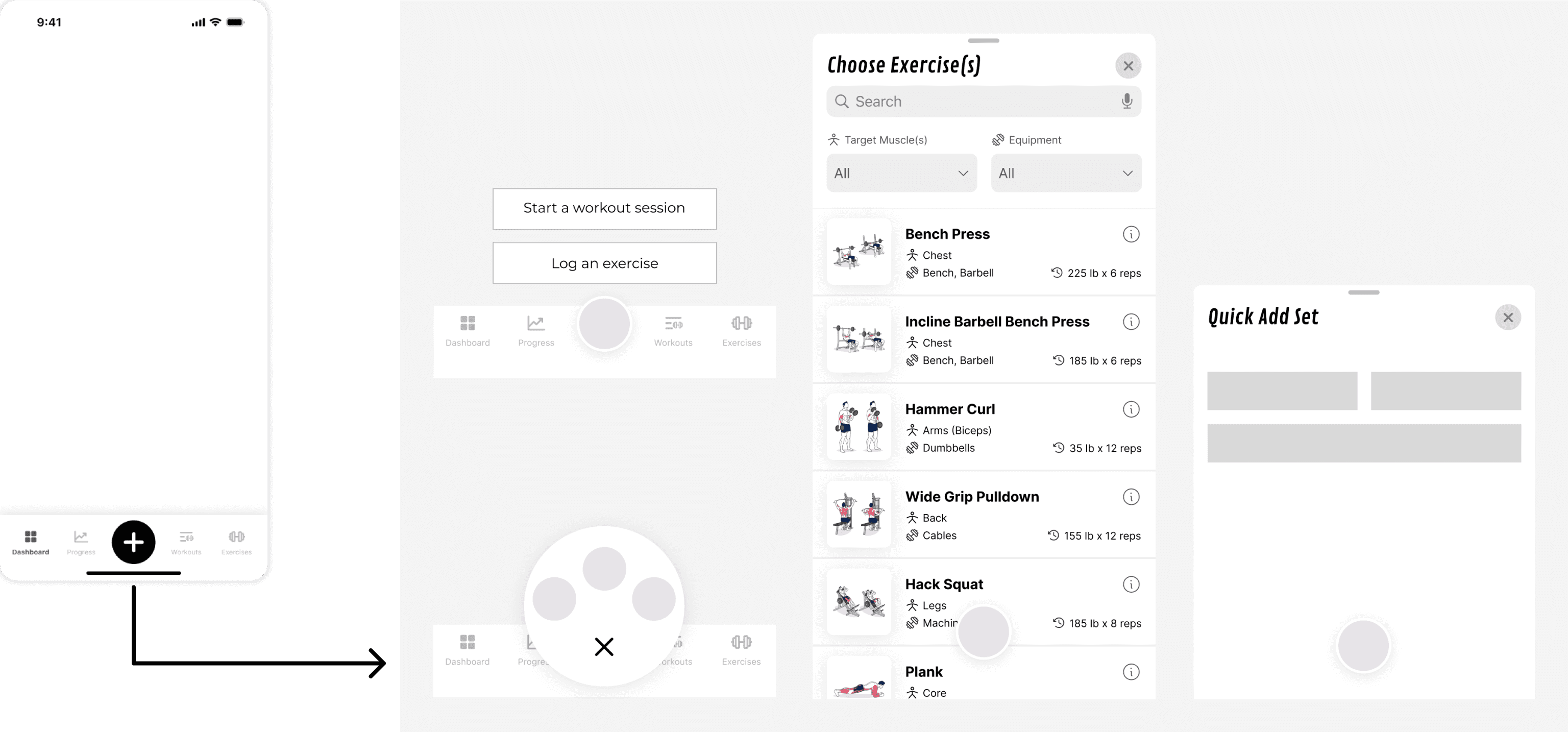
Design Decision
Use a small, anchored pop-up instead of a full modal or screen transition
Layout: Rectangles vs Circles
I tested different layouts for the two action options. Rectangles looked heavy and stiff. Circular buttons matched the central action button and felt smoother to interact with.

Design Decision
Use circular buttons to keep interactions fluid and consistent with the main button
Icon Selection
The best-performing icons were already used elsewhere in the app. Reusing them made both actions instantly recognizable.
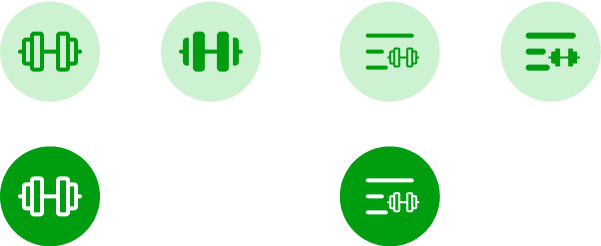
Design Decision
Reuse familiar icons from the app to reinforce clarity and reduce guesswork
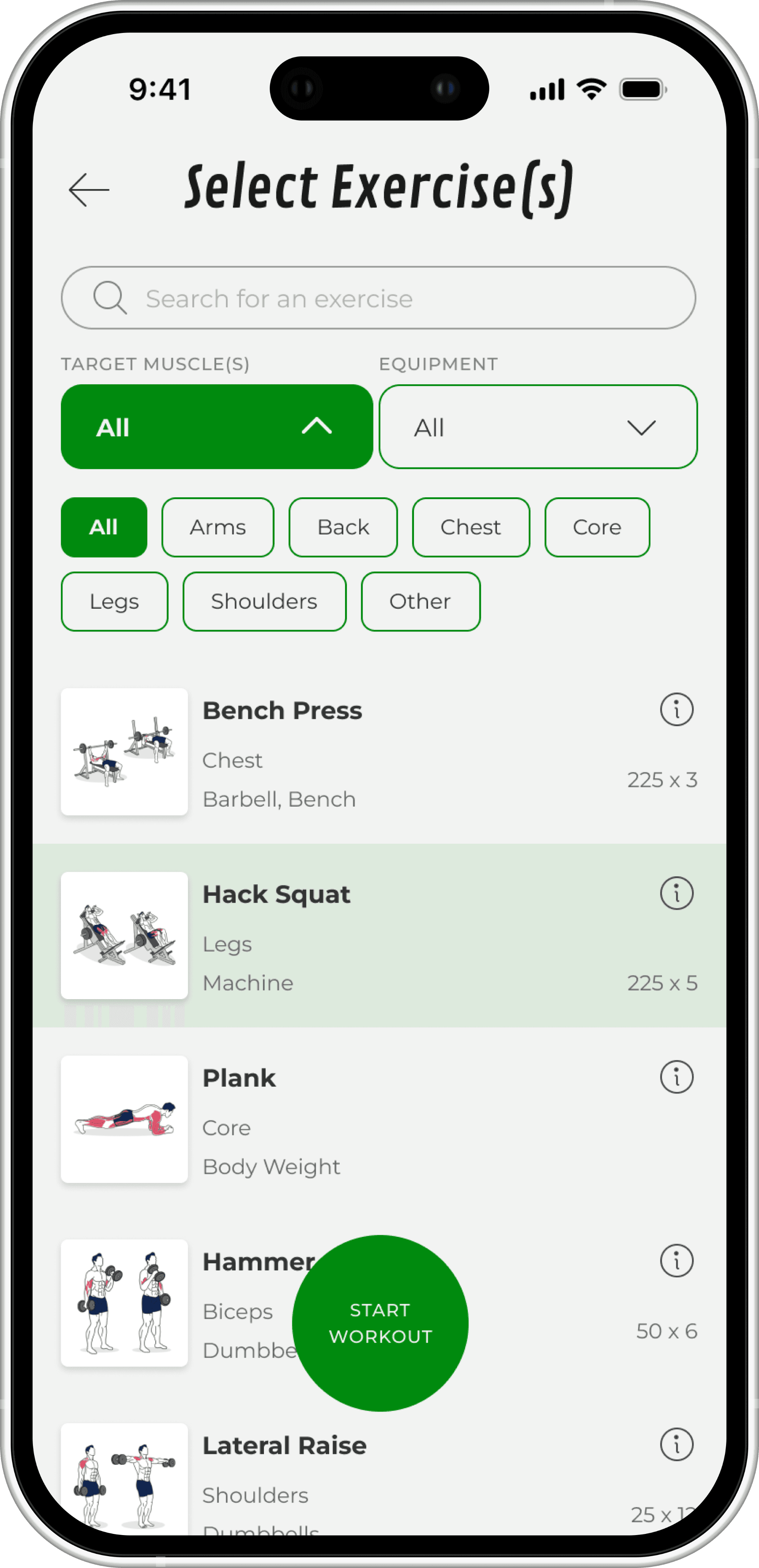
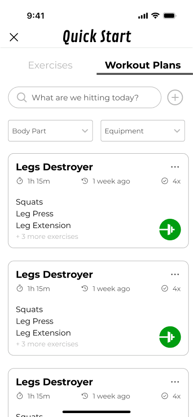
Workout Plan Cards
Starting with structure, not guesses
I wasn’t sure what people actually needed to see when scanning workout plans. Should it be the total time? Last time completed? A list of exercises? I had too many possibilities and not enough clarity.
So I created a low-fidelity card using only boxes and asked users what they thought each part was.
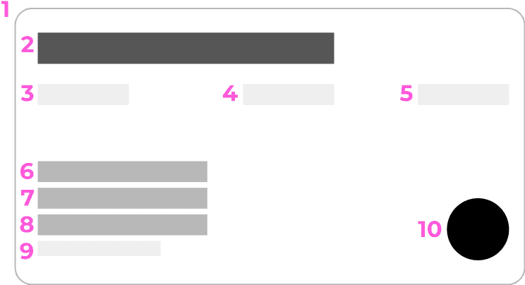
Layout: List View vs Paragraph View
The first layout decision was how to show the exercises in each plan.
Paragraph-style descriptions were harder to scan
List-style formatting made it easier to glance and mentally check what was inside
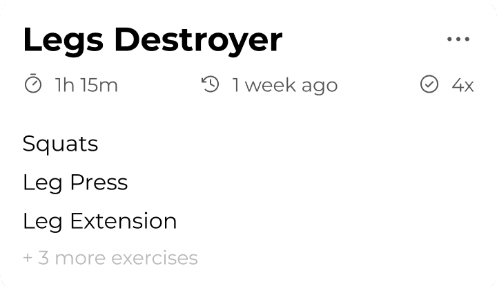

Design Decision
Use list-style formatting for clearer, faster recognition of included exercises
Size & Structure
Since workouts were made of multiple exercises and didn’t change often, I gave the cards more breathing room. A wider layout made room for extra context and kept the content structured.
Design Decision
Use full-width cards for workout plans to reflect structure and content depth
CTA: Making the Card Actionable
Some users didn’t realize they could tap a card to begin. I tested three options: no CTA, a full rectangle button, and a small circular icon.
The circular CTA felt most familiar, like a play button. It gave the card just enough affordance without crowding the layout.
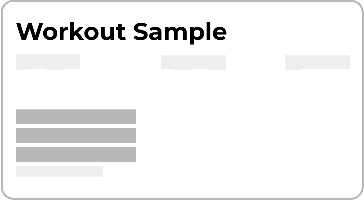

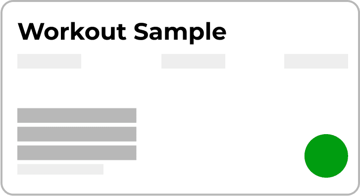
Design Decision
Use a circular CTA icon for a familiar, lightweight tap target
Rebuilding for the MVP
While I was designing extra features like workout previews and data visualizations, the developers had already started building the core interface based on the low fidelity wireframes. At some point, we realized we weren’t in sync. We had different expectations about what was being built, and things started drifting.

To get everyone on the same page, I paused on new features and shifted focus to a clean MVP. We simplified the app to just the essentials:
I adjusted the designs and user flow to match the tools the developers were using and made sure everything felt cohesive.
This version gave us a stable base to build from without getting ahead of ourselves.
Alignment and handoff
Once the MVP was rebuilt and the system was cleaned up, everything finally lined up. The design matched the dev tools, the features were scoped realistically, and we had a shared version of the product that everyone understood. It wasn’t packed with features, but every screen and interaction had a clear purpose.
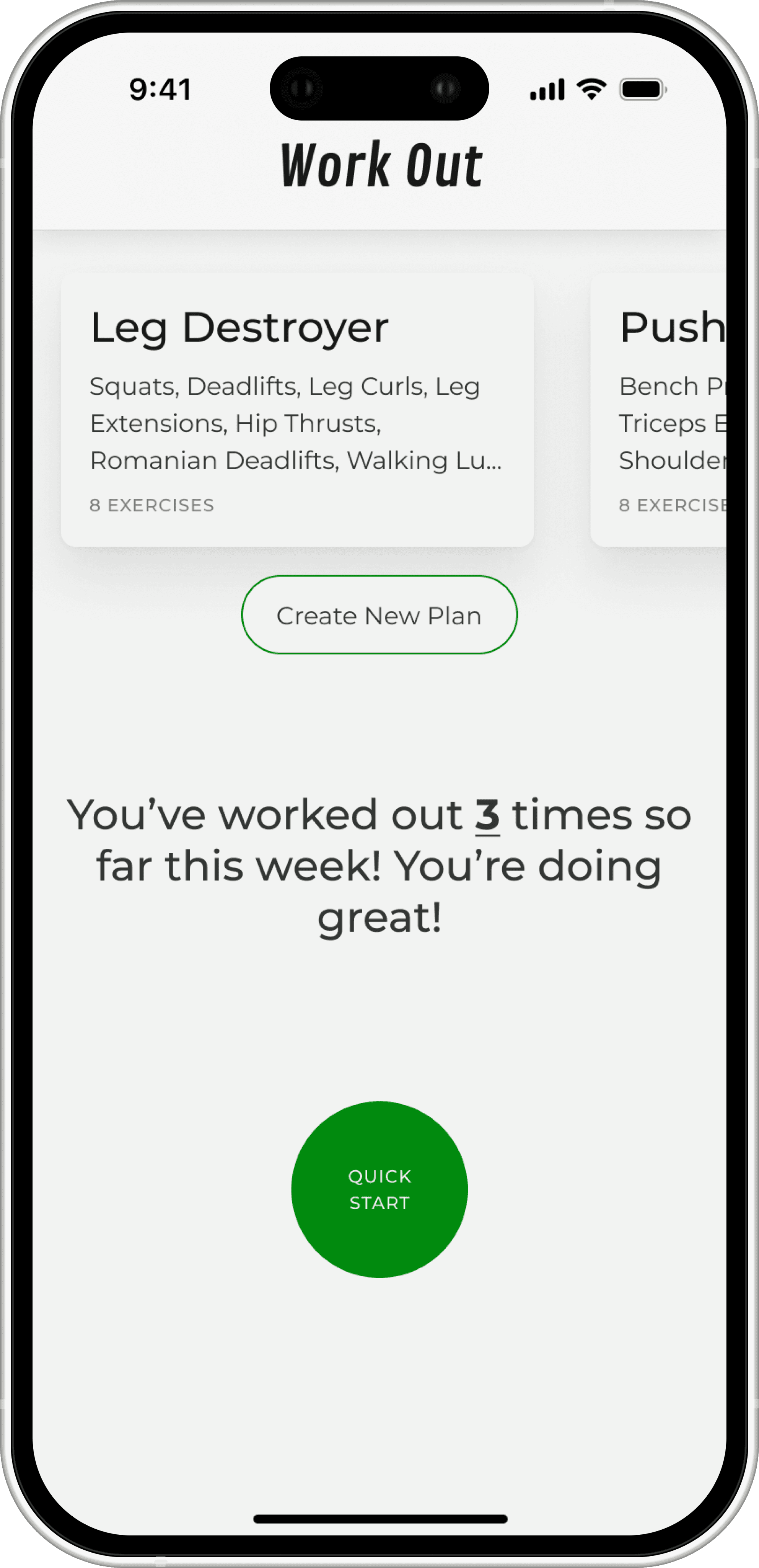
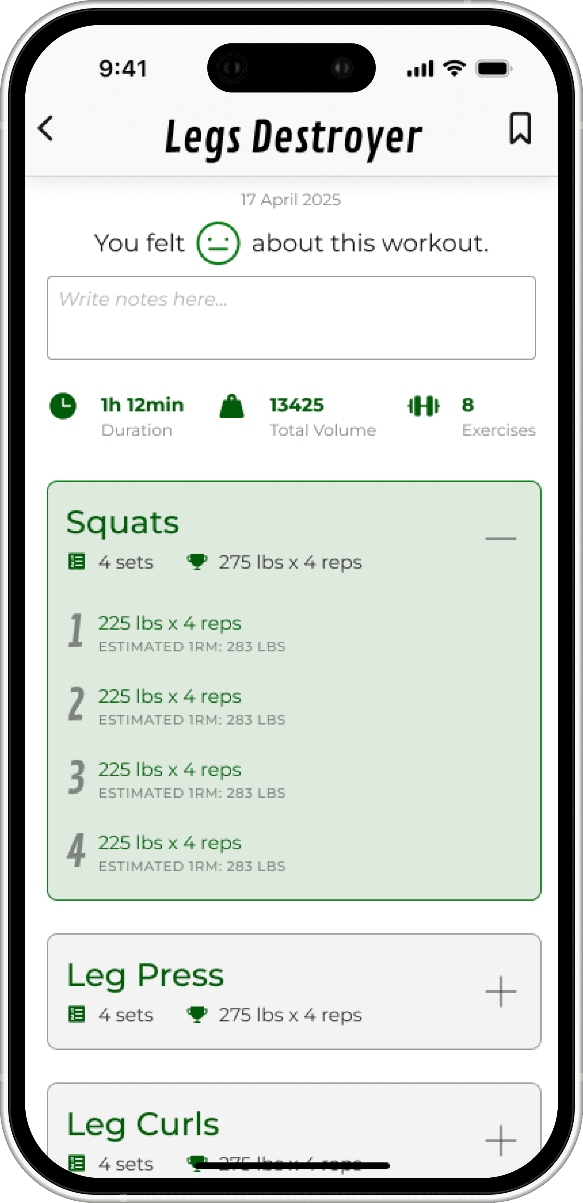
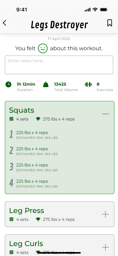
The MVP
A focused, frictionless way to log workouts from start to finish.
What I Learned
Staying flexible and focused when things get messy
Nothing about this process went in a straight line. Some days I was designing future features, other days I was scrambling to match the MVP build. I thought having a design system would make everything smooth, but I learned fast that things change. A lot.
Working with users helped me see what actually mattered. Working with developers helped me realize how much I had to let go. I couldn’t control everything, but I could stay clear about the purpose behind each screen.
In the end, we built something simple, functional, and ready to grow. That felt like a win.
Back to the Top