College Action Program
Streamlining mentor workflows to prevent summer melt and support students' transition to college.
Overview
College Action Program (CAP) is a platform designed to help students transition from college acceptance to their first day of class. While CAP’s initial design focused on students, it lacked tools to address the unique challenges mentors face such as high caseloads, manual processes, and disorganized resources.
This sprint focused on designing CAP’s first mentor-facing features, enabling mentors to streamline workflows, prioritize at-risk students, and provide timely, personalized support.
Role
UX Designer
Project Manager
Team
4 UX Designers
1 Product Owner
Tools
Figma
FigJam
Duration
3 Weeks
Key Contributions
During this sprint, I collaborated with a team of UX designers, the Product Owner, and stakeholders. My contributions included:
User & stakeholder interviews
Competitive & comparative analysis
Facilitating design studio sessions
Feature prioritization
Wireframing & prototyping
Usability testing
Managing timelines & deliverables
Disclaimer: I apologize in advance for the amount of CAP puns and acronyms that are in this case study. I should've CAPped myself at 1.
Context
Putting the CAP on Summer Melt
College Action Program (CAP) was created to address "summer melt," a phenomenon where many students, especially those from low-income or first-generation backgrounds, encounter barriers such as financial challenges and complex enrollment processes that hinder their path to college. CAP’s mission is to help students overcome these obstacles, shifting the focus from awareness to attendance and retention.
UnCAPping CAP's Goals
In our initial meeting with CAP’s founder, we discussed the platform’s overarching mission and its two core business goals:
Increase College Enrollment
Help students transition from acceptance to their first day of college, addressing summer melt.
Enhance Institutional Support
Provide actionable data to institutions to improve enrollment strategies and retention efforts.
While CAP’s tools had been designed primarily with students in mind, we identified an opportunity to expand its impact by supporting mentors who are key players in guiding students through the enrollment process.
Mentors at the Center
Mentors are a critical bridge between students and institutions, ensuring students receive the guidance they need while helping institutions achieve their enrollment goals.
Research
Challenges And Perspectives of Mentors
To get a better sense of the challenges that mentors face in guiding students through college enrollment, I created a discussion guide that my team and I used to interview five mentors from federal TRIO programs, college access programs, and high schools. These conversations gave us firsthand insights into the obstacles they encounter daily.
One interview stood out: a mentor arrived late because she was helping a student through a personal crisis. It was a small but powerful reminder of how much these mentors care, not just about academics, but about their students as people.
Mentors Pushed to CAPacity
Through these interviews, we uncovered a wide range of challenges that mentors face. From juggling high caseloads to creating ad-hoc systems for tracking progress, they often have to solve problems creatively with limited support. To make sense of these findings, we used affinity mapping to discover common themes and identify the most pressing challenges.

Choosing Actionable Problems
From the broader themes identified, we prioritized three critical areas that directly affect mentors' workflows.
Personalized Support
"Students who really need help often don't reach out so I’m not always sure how to help."
Mentors struggle to provide personalized help due to high caseloads and lack of active outreach from students.
Tracking Progress
"We use Google Docs to track everything. It was all very manual and time-consuming."
Mentors rely on manual tracking tools that are time-consuming and inefficient, making it hard to support students effectively.
Accessing Resources
"We have to pull information from different places and it's on us to keep track of it all"
Mentors struggle to find and access resources quickly, slowing down their ability to support students effectively.
The Will to Support Is There. The Tools to Do It Are Not.
Mentors are deeply committed to helping students succeed, but they struggle with overwhelming caseloads, inefficient processes, and scattered resources, making it hard to provide timely and personalized support.
Design
Creating a Cohesive And Pleasant Mentor Experience
Using insights from our research, we focused on designing mentor-facing features to address their biggest challenges: overwhelming caseloads, inefficient tracking, and scattered resources. Our goal was to empower mentors to streamline workflows, prioritize at-risk students, and provide timely, personalized support.
Conceptualizing A Problem
To guide the design process, I translated mentor pain points into actionable How Might We (HMW) questions and facilitated collaborative design studio sessions to explore different ways to address mentor needs:
Focusing on What Matters Most
Through brainstorming and alignment with CAP’s goals, we prioritized features that addressed these needs. Revisiting CAP’s student-facing app helped me identify existing tools, like messaging and task lists, that could be adapted for mentors.

I took ownership of three key solutions, contributing to the overall mentor experience by focusing on these features:
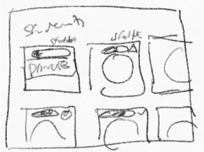
Prioritized Student Lists
Mentors often struggle to identify students who need support the most, especially those at risk of “summer melt.” I designed the Prioritized Student Lists feature to help mentors quickly spot high-priority students.
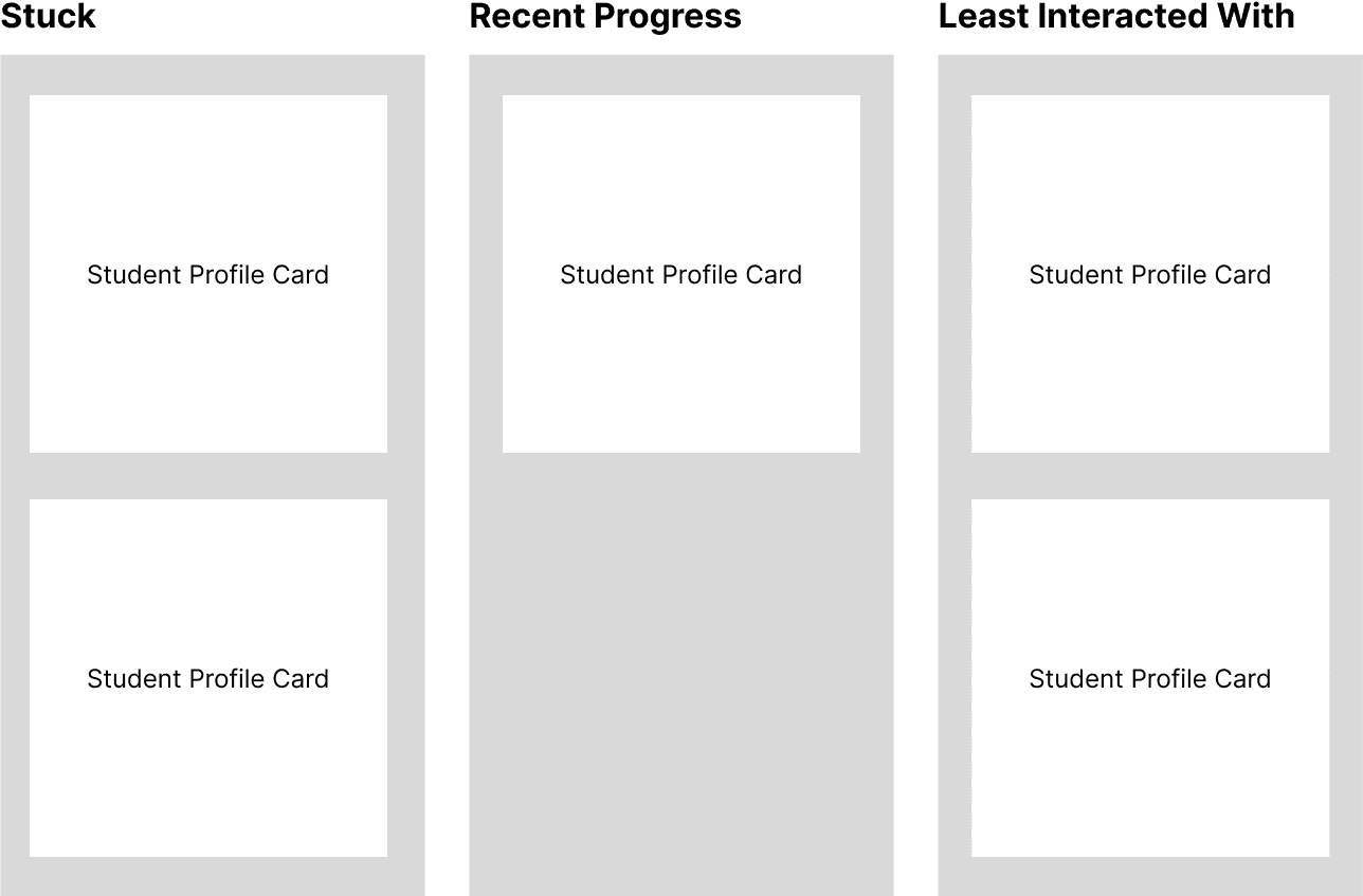
Kanban Board
Clear structure for grouping students by status.
Easy to scan broad categories at a glance.
Lacked the flexibility needed for large caseloads, potential to become visually overwhelming
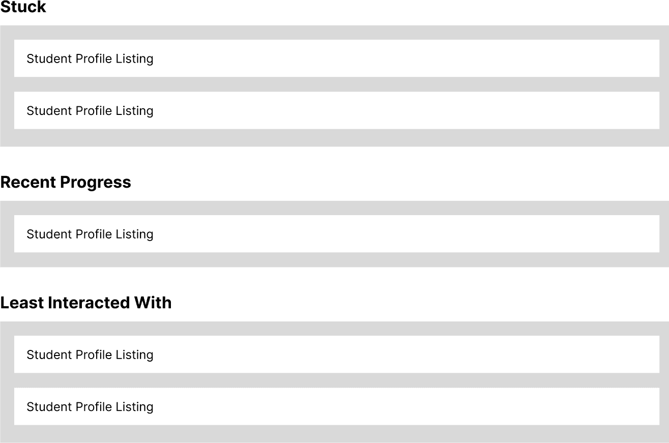
List View
Simplified navigation and reduced visual clutter for high caseloads.
Retained the grouping logic from the Kanban Board.
Lost the quick, visual clarity that made at-risk students stand out.
Alert Notifications
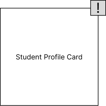
Made at-risk students more visible.
Provided an additional layer of prioritization.
Felt disconnected from the broader workflow.
Added unnecessary complexity.
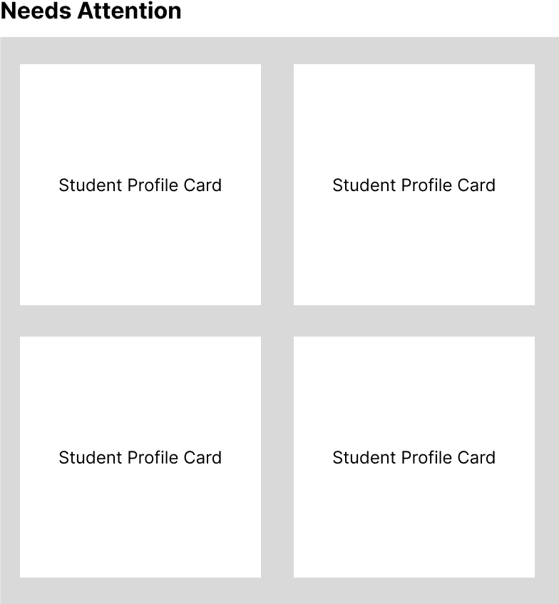
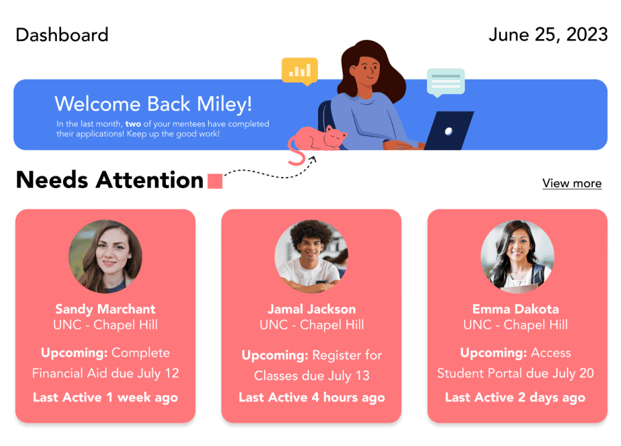
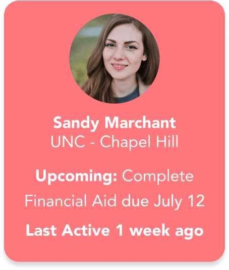
Grouped Student Profile Cards
The final design focused on a single "Needs Attention" category, simplifying the layout and removing redundant alerts. Other statuses, like "Recent Progress," were handled through other features like Notifications for Key Milestones.
Why This Worked
Simplified the view, reducing cognitive load.
Allowed mentors to quickly focus on the most critical students.
Progress Tracking
Tracking student progress was a challenge for mentors managing high caseloads.

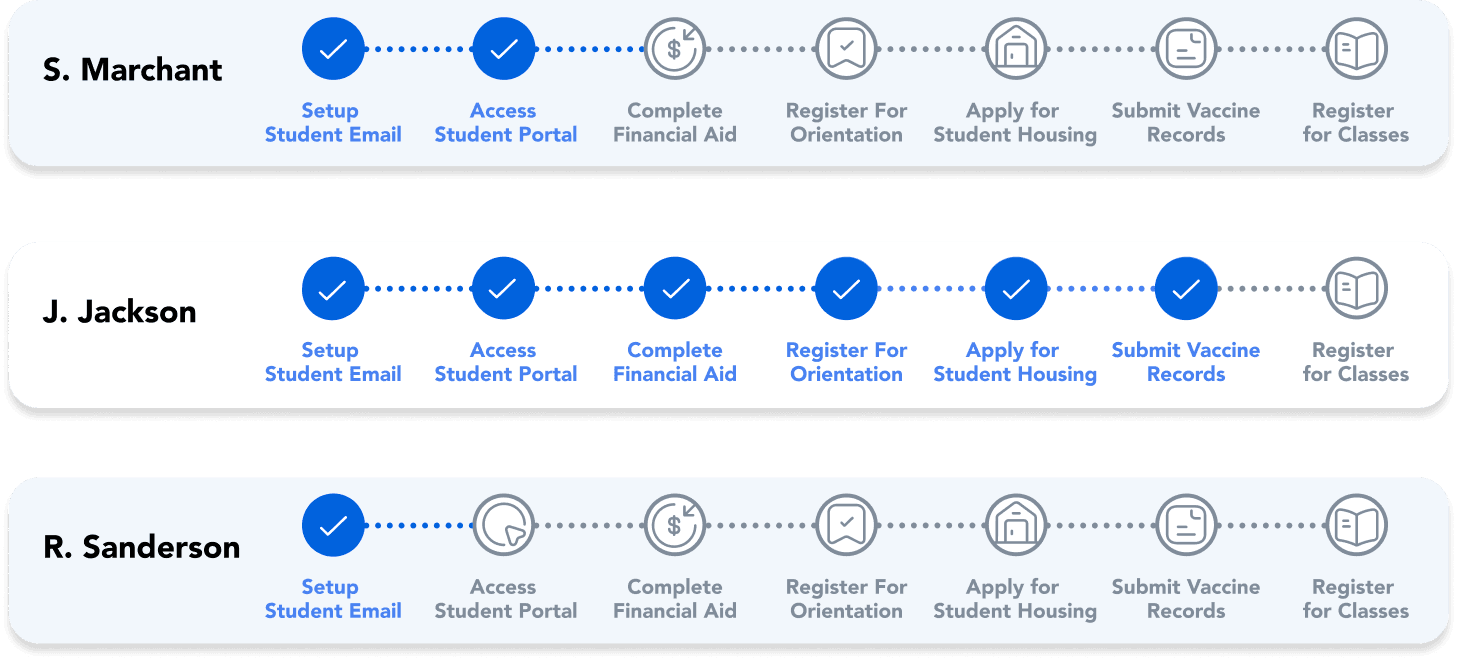
Visual Overview
I designed a progress timeline that automated updates and mapped each student's enrollment journey, providing mentors with:
A real-time snapshot of student progress.
Clear visibility into delays or missed steps.
Student Profiles
Mentors needed quick overviews and detailed insights for personalized support.
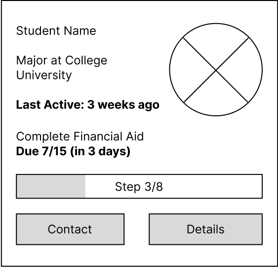
Profile Cards
I started with Profile Cards that displayed essential student information, such as their name, current enrollment step, and a progress bar. This design allowed mentors to quickly scan and access key details without overwhelming them.
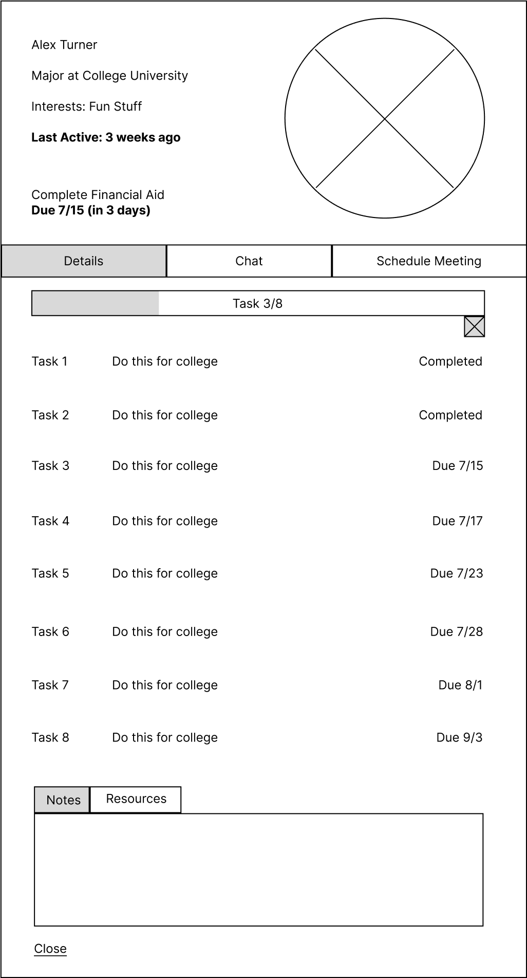
Detailed Profile Page
For situations requiring more context, I designed a Detailed Profile Page that included everything a mentor might need: tasks, notes, and communication tools, all in one centralized place. This ensured mentors could deep dive into individual student needs without switching between multiple tools.
CAPping It All Together
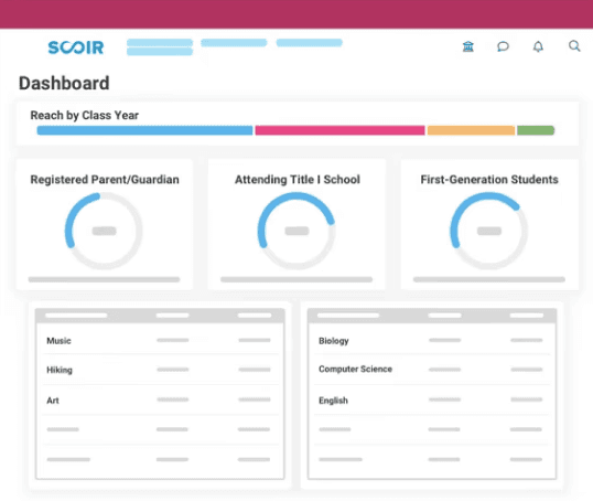
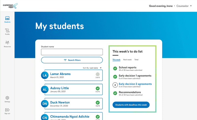
After refining individual features, my team and I were left with a bunch of pieces, unsure of how to put it together. To help us move forward, I looked at tools mentors were already familiar with, like SCOIR and CommonApp.
These platforms emphasized the need for a clear, intuitive dashboard tailored to CAP’s goals. By building on familiar systems, we could ensure smoother adoption and usability.
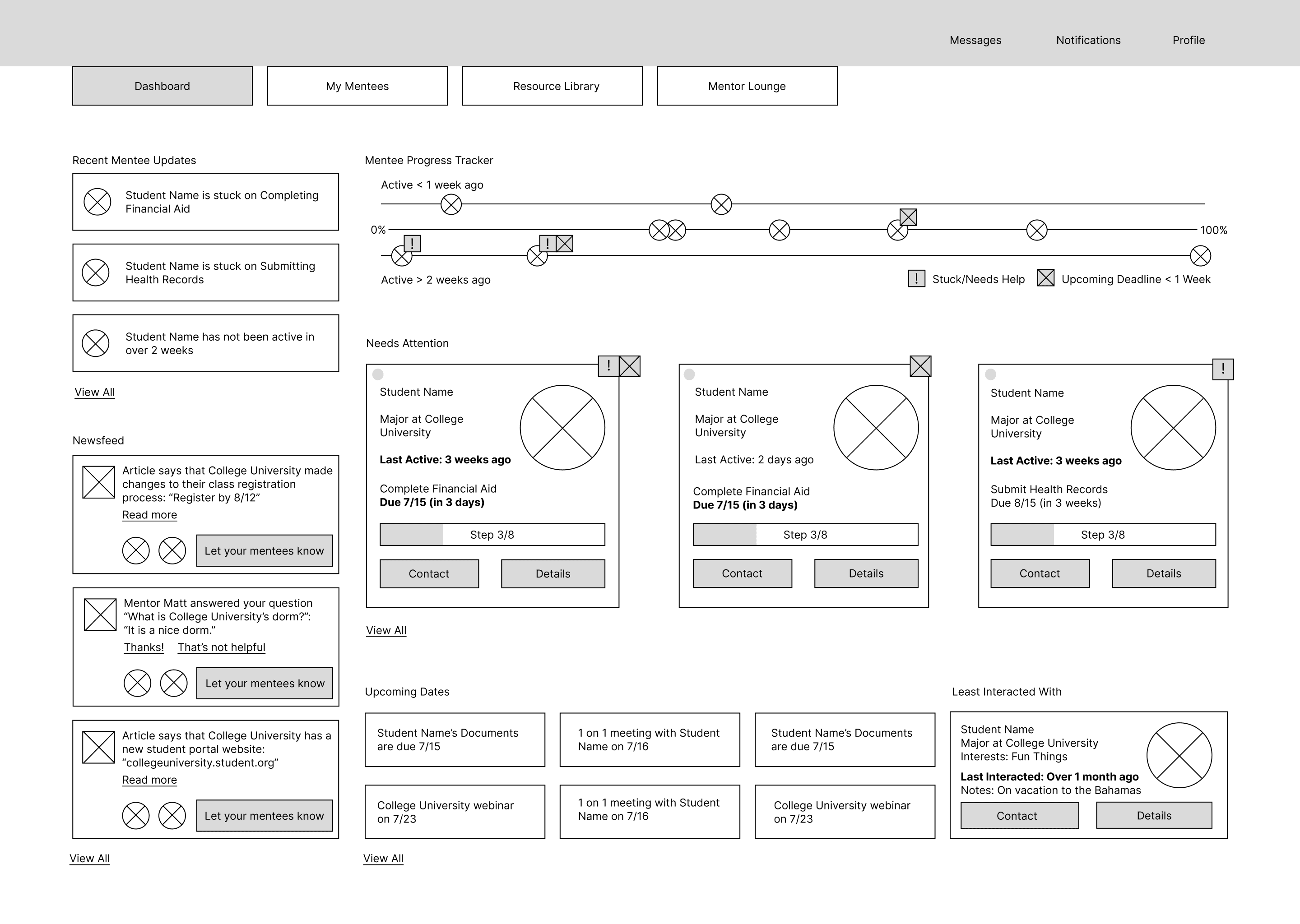
Mentorship in Action
To ensure the dashboard aligned with mentors' real-world workflows, I mapped a typical user flow based on their daily tasks. This helped identify how mentors would interact with the platform and which areas required extra attention. The flow included:
This flow provided a foundation for testing how effectively the dashboard supported these activities.
Usability Testing the Dashboard's CAPabilities
With this user flow in mind, I led usability testing to evaluate how well the dashboard supported these tasks. During testing, mentors highlighted several areas for improvement:
Cluttered Interface
Inconsistent typography and layout made it difficult to locate key actions and interpret the progress tracker.
Distracting Features
Non-essential elements like the Newsfeed and Upcoming Deadlines drew attention away from critical tasks.
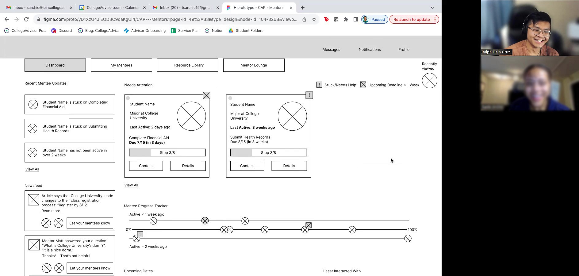
Using these insights, we refined the dashboard by:
Improving Visual Hierarchy
Simplified typography and layout for easier navigation.
Streamlining the Progress Tracker
Focused on key milestones to reduce cognitive load.
Decluttering the Dashboard
Removed distractions to highlight core priority features.
After refining the layout, we applied CAP’s design system to ensure consistency in colors, typography, and components, creating a cohesive and intuitive experience for mentors.
Final Design Solution
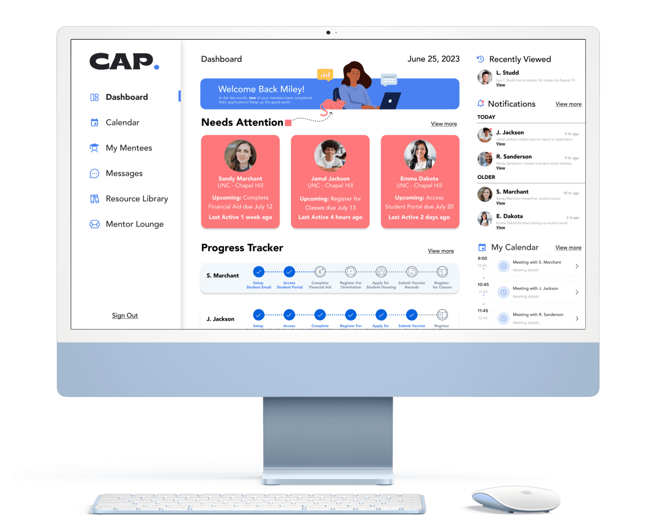
CAP's Mentor Dashboard: Empowering Mentors to Support Students Proactively
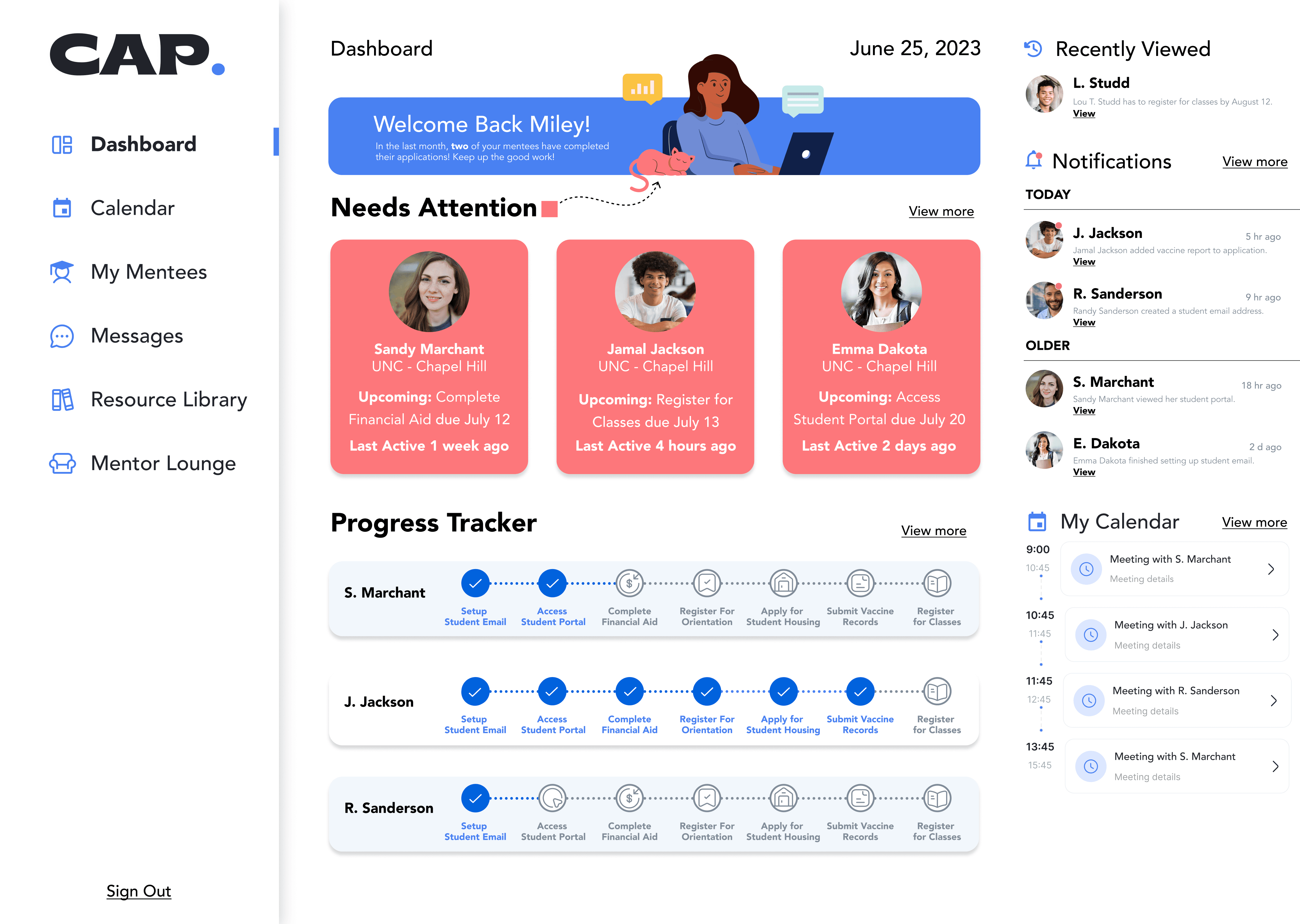
Key Features
Prioritized Student Lists
Mentors can quickly identify students who need urgent support, especially those at risk of “summer melt.” This feature lets them take immediate action and manage their time more effectively.
Student Profiles
Mentors have access to detailed student information, including current enrollment status and communication options. A snapshot card provides key details, with an option to view a more detailed page for in-depth insights.
Progress Tracking
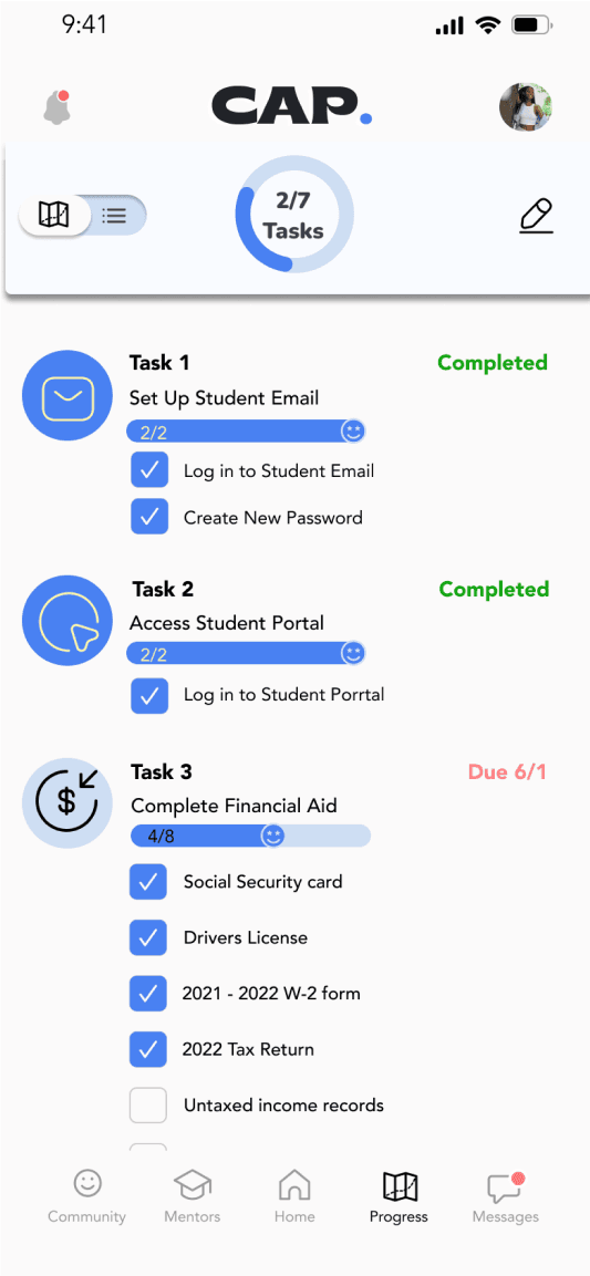
A simplified, linear task list allows mentors to see where each student is in the enrollment process and track progress with ease.
Additional Key Features
While my primary focus was on developing the Prioritized Student Lists, Student Profiles, and Progress Tracking, my teammates contributed other key features that tackle other crucial mentor challenges:
Resource Library and Mentor Lounge
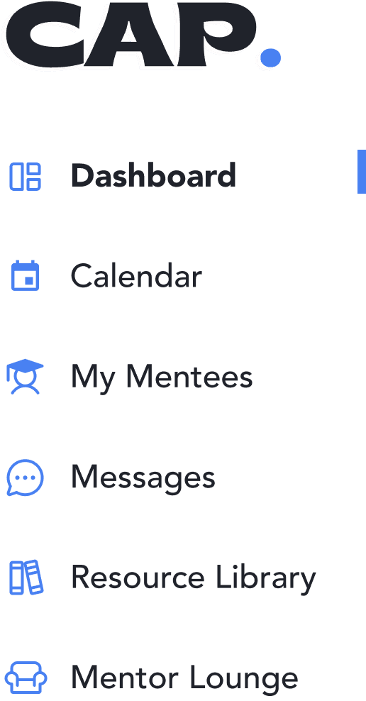
The dashboard includes navigation to a centralized resource library and a mentor lounge, providing quick access to documents and peer collaboration opportunities.
Recently Viewed, Notifications, and Calendar
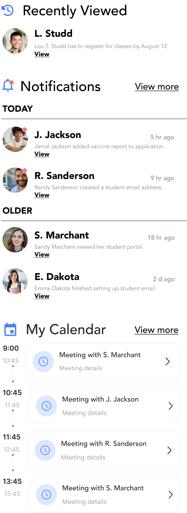
The dashboard also features a right-side panel with recently viewed students, notifications, and an upcoming meetings calendar, keeping mentors informed and organized while minimizing clutter.
Final Prototype
Outcome
Mentor Experience: Before and After
We looked closely at how the CAP platform improves mentor workflows by tackling key challenges, strengthening mentor-student connections, and supporting CAP’s mission to boost college enrollment.
A Prioritized Student List to highlight at-risk students.
Reduced stress for mentors and improved student retention.
Progress Tracking to provide real-time updates on milestones.
Students stay on track for college enrollment, reducing the risk of summer melt.
Personalized Messaging to enable tailored communication.
Stronger mentor-student relationships, leading to better engagement and motivation.
A Resource Library to centralize and simplify access to materials.
Mentors can provide more personalized and effective support to students.
Enthusiasm for The Future of CAP
The CAP team was thrilled with the mentor dashboard, particularly how it streamlined workflows and improved connections with students. Founder Lauren Mills shared how the design aligned seamlessly with CAP’s mission, calling it a “game-changer” for mentors navigating the complexities of summer melt.
Looking ahead, CAP plans to release their MVP in December 2024. This dashboard is just the beginning; future updates may include enhanced student tracking, expanded communication tools, and tailored recommendations for mentors. These advancements aim to further empower mentors and support students on their journey to college, creating an even greater impact.
Reflection
What I Learned
This project reinforced the value of truly understanding the people you're designing for. Hearing mentors share how deeply they care about their students (while feeling overwhelmed by caseloads and limited resources) was humbling. It reminded me that thoughtful design isn’t about flashy features but about removing barriers and equipping users with the tools they need to succeed.
What Was Challenging
The biggest challenge was balancing mentors’ needs with CAP’s broader goals. Mentors wanted detailed, personalized tools, but scalability and institutional requirements meant we had to streamline. At times, it felt overwhelming, but collaborating closely with the team made the process more manageable. By playing to each team member’s strengths, we worked smarter, made better decisions, and delivered a solution we could all be proud of.
Looking Back and Moving Forward
If I could go back, I’d refine our interview process to dig deeper into specific UX challenges. Sharper insights could’ve led to even stronger solutions. That said, I’m proud of how we approached this project: with empathy for users and collaboration at the forefront. Moving forward, I want to bring these lessons into future projects, staying focused on balancing user needs with business goals, designing with intention, and fostering teamwork to create meaningful experiences.
Thank you for reading! Please feel free to reach out with any questions or to connect.

